Already solved v0.2 update
With this update, I'm mostly trying to address the feedback I've received so far; it's mostly quality of life changes, and there's very little new content for now - even though I've made quite a few new levels, they're not quite ready to be released as I'll discuss at the end of this post.
The Line

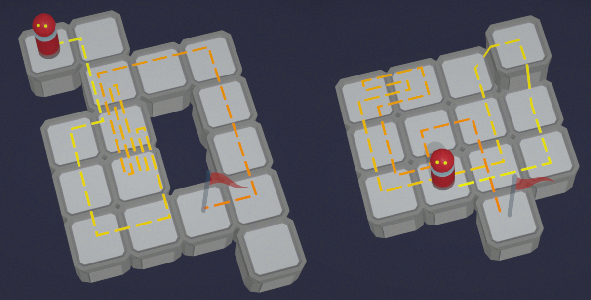
A 'simple' line showing the puzzle's solution. The most requested feature by far - if you've read the comments under Aliensrock's video that introduced the vast majority of players to my game, you know that just about everyone asked for this. I underestimated how helpful it would be (I mean, I can remember the path, how come the players can't?), but making it readable without covering the puzzle was nontrivial - that's why I abandoned it for the first version of the game.
Figuring out where exactly the line should go so that it crosses itself as little as possible, doesn't overlap itself, and has even-ish spacing when possible, is a really annoying algorithmic problem - both insufficiently defined and with lots of corner cases. It's the main reason why this update took so long - I kept finding solutions where the line didn't look quite right, and then I kept putting off fixing it and working on more fun stuff, and I'm still not 100% happy with it, but I suppose it's good enough.
Rant over. The line appears whenever the players puts their mouse on the goal, views the solution or tests their puzzle.
Better feedback for incorrect puzzles

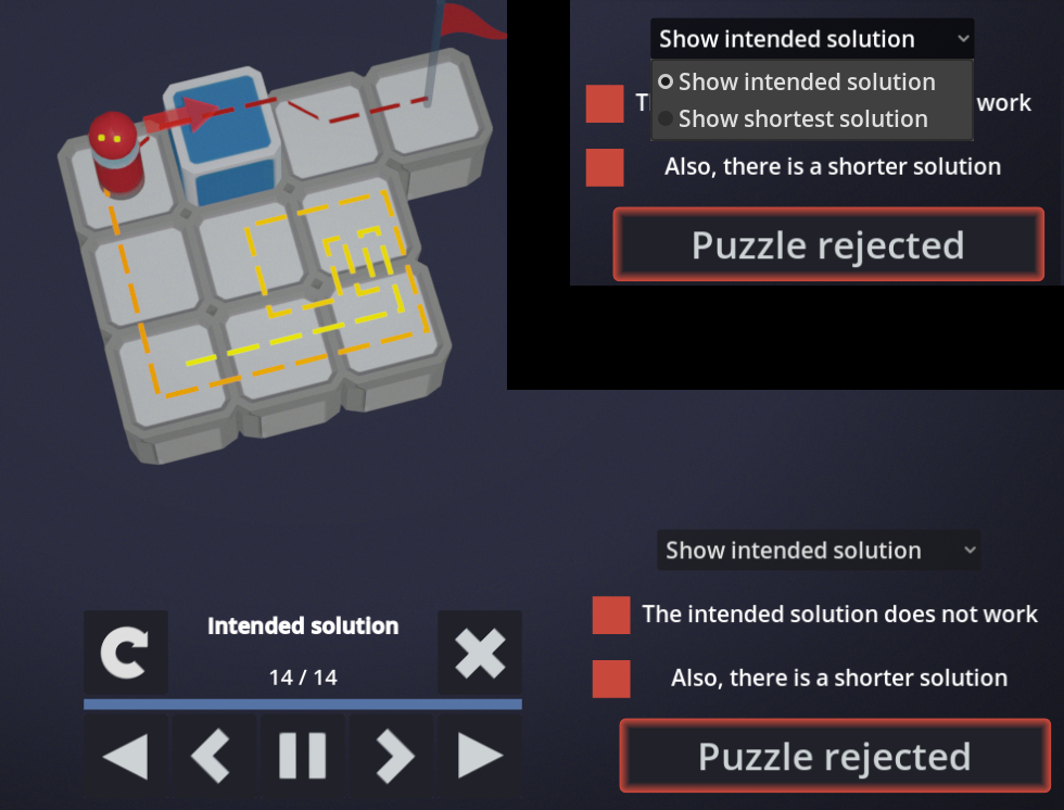
Previously, if the intended solution didn't work for the puzzle you've built, the game didn't even check whether the puzzle has a solution shorter that the intended one - you've already failed, why would the game waste the CPU cycles, right? ...it turns out that showing more info to the player is actually a good thing, and I've seen multiple players think that their puzzle is unsolvable if the game doesn't show them the shorter solution. That's why the game will no longer fail to appropriately dunk on the player when their puzzle is doublewrong.
Controls improvements
I've also received some feedback about the control scheme - right-clicking twice to first deselect the object the player's been placing and the to delete something in the puzzle felt bad, especially if they then had to move the mouse back to the left side of the screen to select something again. I didn't find a sane way to remove the double right click - the previews showing the player what's going to be deleted or placed are way too useful and without switching the mode from 'placing an object' to 'deleting' it's not possible to show them.
However, the 'shop' now can be controlled without moving the mouse: left-clicking the puzzle now selects the last selected object, and it's also possible to select objects using a mousewheel.
Updated/new levels
- 'go Home' was the level that I got the most complaints about. I agree that there was a design problem - the level introduced a new idea, but there was also a bunch of other stuff distracting from this one new thing. That's why I replaced it with three new levels that are quite a bit smaller and more focused (but one of them might actually be harder than the original one was, sorry, couldn't help myself)
- 'Memory training' has been renamed, because The Line has eliminated the need to memorize the path
- 'Couldn't do it without you' - this solution was mde 2 steps longer to eliminate the alternative puzzle found by XelaLacksSkill. I know that I made one of the hardest levels in the puzzle even more frustrating, but at this point I'm more concerned about showcasing the idea behind the puzzle tahn the puzzle's difficulty
- There are three more puzzles I consider changing, but first I want to see whether the quality of life changes make them more fun
...there might be more small changes I'm forgetting about, but that should be about it (e.g. now that I'm reading what I wrote, I remember I've also changed UI scaling for high resolution monitors)
Future updates
I've already spent quite a bit of time on making new levels - however, I think I've sufficiently explored boxes, buttons, and walls (unless I add some filler puzzles), so it's time to introduce new mechanics. I went through quite a few options - ice tiles, ramps, various 'buffs' that would change the player's abilities after reaching a certain square (double push, jump down from walls, no collision and can't enter the goal, ...), placeable checkpoints, ... - and discarded most of them, either because I couldn't come up with enough different ideas that could be turned into a sufficient number of interesting puzzles without alternative solutions, or because they would introduce a lot non-intuitive interactions (and I need the players to somehow figure them out before they build a puzzle). In particular, I've spent over two weeks trying to make colored boxes work (boxes that would turn flat when a button of the same button is pressed) because it felt like a natural extension of the mechanics that are already in the game, but I just couldn't come up with a lot of interesting solutions.
Still, I did find a couple of mechanics that I do want to add to the game, and the first one of them will be 'arrow tiles' - tiles that force anything that steps on them to move in a given direction until it hits something.
Another thing that I've already started working on is controller support, since I've noticed that the game's controls can be mapped to a controller quite well and I know that some people will prefer it over KB&M.
I'm not sure when will I release these two updates (or which one will be first, or whether I'll merge them into a single update), but they will both require quite a bit of UI (and in case of arrow tiles, even new programmer art), so I expect I'll be putting off finishing them again and I'll start working on whatever will seem to be interesting.
Get Already Solved
Already Solved
Build puzzles for their shortest solutions
| Status | In development |
| Author | blasterpoard |
| Genre | Puzzle |
| Tags | Godot, Sokoban |
| Languages | English |
| Accessibility | Interactive tutorial |
More posts
- v0.3 update - 30 new puzzlesMay 08, 2025
Leave a comment
Log in with itch.io to leave a comment.